
Education Startup
Mobile Redesign
challenge
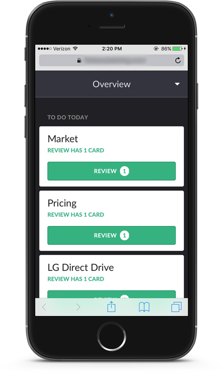
When users first entered the app, they saw an overwhelming list of what they had to do that day — no progress indicator, no hierarchy, no context for which topic’s category they’d be reviewing, no indication of how long it would take, and no visual cues to guide them through which actions to take next. My client want a more personalized landing screen, and for the product to seamlessly guide users to the next step, instead of leaving the choice up to them.
Landing Screen
Before
My Solution: Context, Progress Indicators, and Personalization
I condensed the to-do items for the day into a card-based system, creating clear guidance for users through the app. I added personalized context with the user’s name and the date at the top. Below the date, I added two forms of progress indication: segments that corresponded to completed cards and a numerical list. I noted how many questions were in each review, the title of the review, and how long it would take. I also added an “all categories” button to go back to the home screen, providing additional context.
after

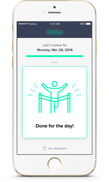
My Solution: Completed Screen
I made the completed screen much visually stronger, but more importantly, extended the progress indicator functionality. After finishing the last review, the segmented bar animates to full completion and the “done” card pops up.
Completed Screen
before

after
My Solution: The Notification Screen on Launch
After the user has completed a couple lessons, this full screen notification pops up upon launch for context, personalization and encouragement.
