Liquid Talent
product strategy, rebranding, Mobile Redesign
challenge
Liquid Talent is a marketplace for professionals to connect in real time, based on location. The marketplace and all activity centered around the map, the search results, and the sign up process. I needed to redesign the convoluted, confusing app to make the process clear, the visuals appealing, and the experience delightful.
My Solution
I streamlined and clarified the functionality. I redesigned the visuals to be cleaner and more appealing. I simplified the logo, making it both modern and timeless. I updated the brand’s green, making it less astringent and more visually pleasing. I transformed the once frustrating experience into a simple, seamless experience for the user.
Landing Screen
Before
after
Individual Talent
On Map
Before
After
In List
Before
After
Profile
Before
After
Search
Before
After
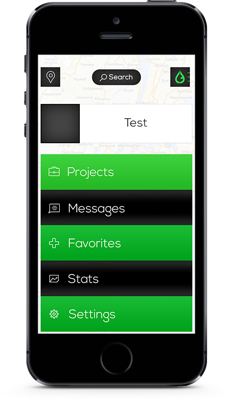
Menu
Signed Out
Before
After
Logged In
Before
After
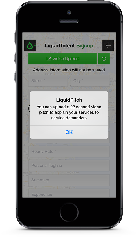
Sign Up
Before
After
Sign up for both TALENT and EMPLOYERS begins with the following two screens
How TALENT finishes signing up
How an EMPLOYER finishes signing up
Logo
I cleaned up, modernized, and refined both the logo and the palette.


