Yahoo! Finance for iPhone
Product Strategy, Mobile Redesign
Challenge
Redesign the Yahoo! Finance iPhone app to look, feel, and function like it fit with the new, main Yahoo! app and the Apple-awarded Yahoo! Weather app. My goal was to incorporate big visuals, clean typography, and a card-based feed. These cards would contain news, stock information, markets, etc., all personalized according to the stocks users tracked in their ‘portfolios’.
Landing Screen
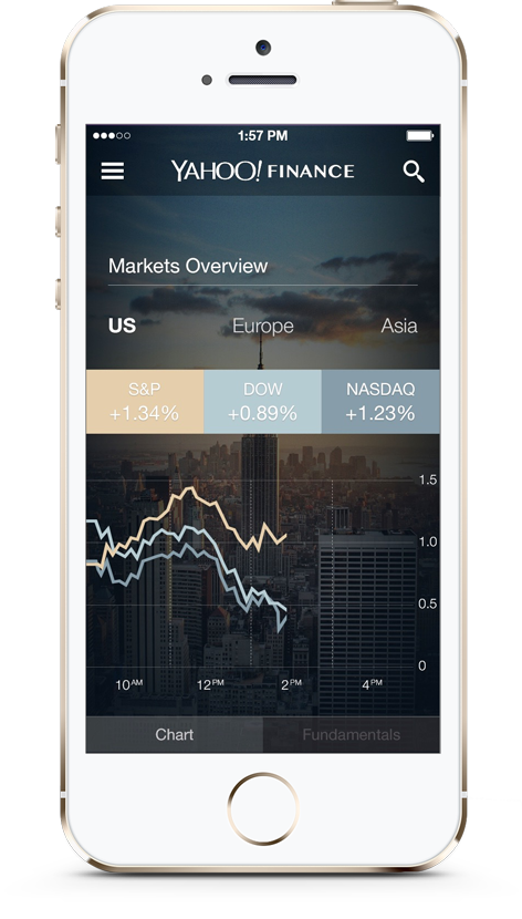
before

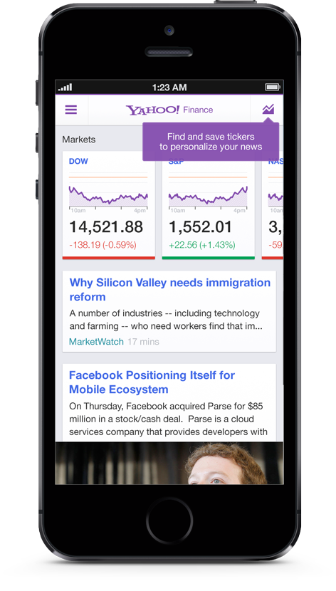
Pre-Marissa Mayer
home screen
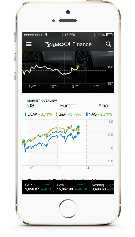
Colleague redesign. The SVP of Design found this to be too “white-washed”. I was then brought onto the project.
My Solution: Personalization
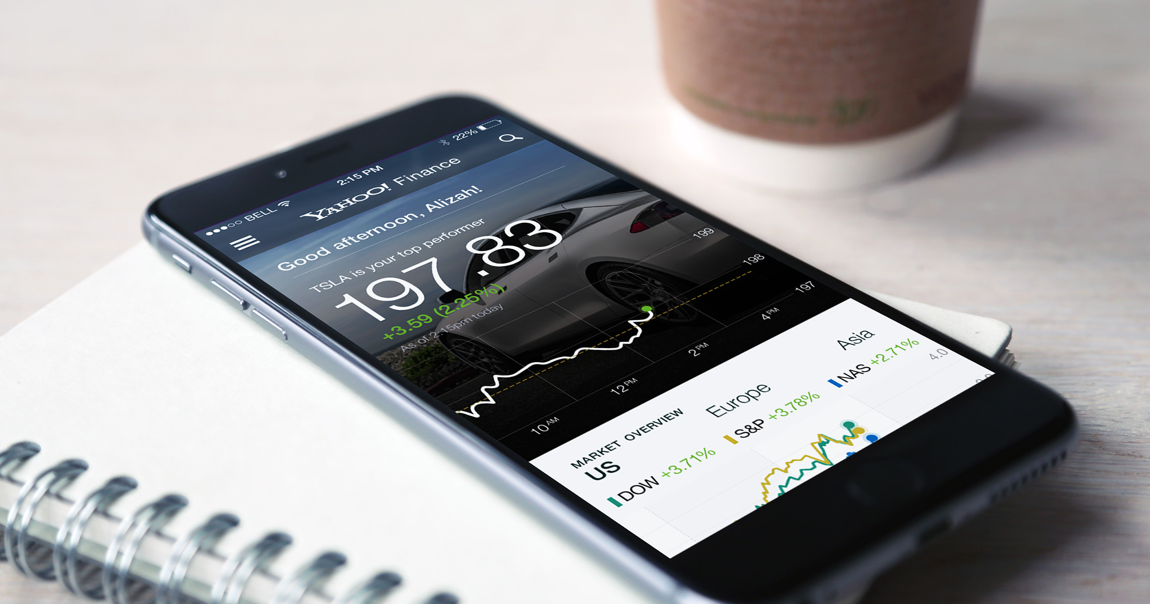
Since the focus was on personalization, I came up with a welcome card upon launch, containing direct messaging, up-to-date information about the stocks in a user's portfolio, and imagery of the nearest major market. At the bottom, I included a real-time ticker that would scroll with the feed (like what you'd experience on classic financial TV).
Initial Wireframes

Feed Wireframe

Individual Stock Wireframe
after v1: initial concepts

Home screen + welcome card, including real-time chart of a user's highest performing stock and a personalized greeting
Dynamically scrolling ticker at the
bottom of the feed
My Solution: Stock-Specific, Card-Based Feeds
The push for big images and big charts continued, as did the push to make Finance look, feel, and function like Weather. My solution: every stock you track in your ‘portfolio’ would have its own feed of news. Like the home feed, each stock feed would begin with a big visual card and real-time chart. Swipe left and right to move between stocks. The home feed always covers the overall markets and general financial news.
after v2: redesign evolution
Individual Stock
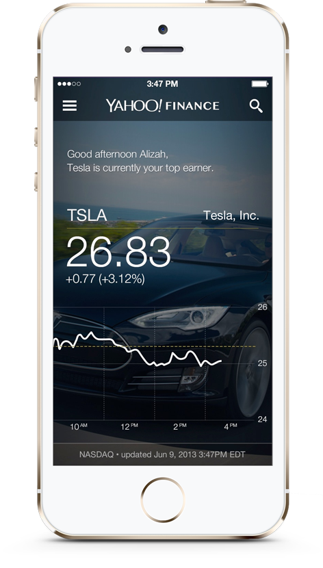
Before

Colleague redesign. SVP of design felt this was also “too white-washed” and, above all, we needed to “nail the chart.” Overall, the unnecessary elements felt too heavy, like adding the card and drop shadow underneath the chart.
after

My redesign. I made the chart full width, and let the content breathe. One of the differentiators we wanted to emphasize was our ability to populate the chart with live data in real time. My solution was the long blinking orange dot.
Full Screen Chart
Before

Colleague redesign. Again, SVP of design felt this was also “too white-washed” and, above all, we needed to “nail the chart.”
after

My redesign. When you turn the phone, the live dot draws the chart in, then long blinks (almost like a sonar visualization). Visually, I created more contrast between the elements. Functionally, I created the ability to add comparison stocks to the chart, view different chart types, and multiple kinds of stock information.

When you hold your finger on the chart, you can scrub to view historical data